Here’s a situation most agencies know well.
You’ve had a genuinely good month. The campaigns performed. ROAS is up. Cost per acquisition came down. You’re feeling confident heading into the monthly call.
Then you share the dashboard and the client goes quiet. They scroll through it, nod a few times, say “looks good” — and you can tell they have absolutely no idea what they’re looking at.
It’s not that they’re not smart. It’s that the dashboard wasn’t built for them. It was built for you.
This is one of the most common and most fixable problems in agency-client relationships. A reporting dashboard that confuses your client doesn’t just make your work look less impressive — it actively damages trust, because confusion breeds doubt. And doubt, over time, ends contracts.
Here’s how to build a marketing reporting dashboard that your clients can actually read, understand, and use to make decisions.
Start With One Question: What Does This Client Actually Care About?
Before you pick a tool or decide which metrics to include, you need to answer this question for every single client you work with.
An ecommerce brand cares about revenue, ROAS, and cost per purchase. A lead generation business cares about cost per lead and lead quality. A local service business might care most about phone calls and direction requests. A SaaS company wants to know about trial signups and demo requests.
None of them primarily care about impressions. None of them lie awake thinking about your click-through rate. And yet these are the metrics that end up dominating most marketing reports, because they’re easy to pull and they always look like something is happening.
The first rule of a good client dashboard is this: every number on the page should connect directly to something the client is trying to achieve. If you can’t explain in one sentence why a metric is there, remove it.
The Three Layers Every Good Dashboard Has
The clients who feel most confident about their marketing all tend to get reports structured the same way — three layers of information, moving from the big picture down to the detail.
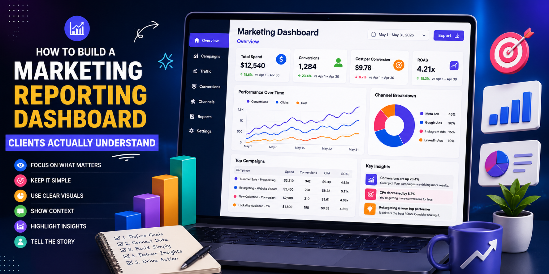
Layer 1 — The Headline Number
One number at the top. Revenue generated. Leads delivered. Sales made. Whatever the primary goal is, it goes here in large text, with a comparison to the previous period so the client immediately knows whether things went up or down.
This is the first thing the client sees. If it’s positive, they feel good before reading another word. If it’s down, they know to pay attention to the rest of the report. Either way, they’re oriented immediately.
Layer 2 — The Supporting Metrics
Three to five metrics that explain how you got to that headline number. For a Google Ads campaign this might be: total spend, ROAS, cost per purchase, number of conversions, and average order value.
These numbers tell the story behind the result. They answer the question the client will naturally ask after seeing the headline: how did we get there, and was the spend justified?
Keep this section tight. Five metrics maximum. If you’re tempted to include more, ask yourself whether you’re adding information or adding noise.
Layer 3 — The Detail (For the Interested Few)
Campaign-level breakdowns, keyword performance, audience data, device splits — this goes at the bottom or in a separate section. Not every client will look at it, and that’s fine. But it needs to be there for the clients who do want to go deep, and for the conversations where you need to show your work.
The key is that the first two layers should stand completely on their own. A client should be able to read just the top section, understand the situation, and feel informed — even if they never scroll to the detail.
The Metrics Most Agencies Include That They Shouldn’t
This is the uncomfortable part. A lot of the metrics agencies default to including in reports are there because they look like activity, not because they demonstrate value.
Impressions. Unless you’re running a brand awareness campaign with impressions as an explicit goal, this number tells your client almost nothing about whether their business is growing. A million impressions and zero sales is a failure, regardless of what the impression graph looks like.
Click-through rate in isolation. CTR is useful for diagnosing ad creative performance internally. For a client report, it means very little without conversion data alongside it. A 5% CTR is irrelevant if none of those clicks are buying anything.
Engagement rate on paid social. Likes and shares do not pay invoices. Unless the client’s explicit goal is community building or brand engagement, this metric should live in the appendix at best.
Bounce rate without context. A high bounce rate on a landing page might mean people aren’t interested. It might also mean they found what they needed in ten seconds and called. Without context, this number causes unnecessary worry.
None of these metrics are useless — they’re genuinely helpful for internal optimisation. But they don’t belong at the top of a client dashboard unless they’re directly tied to a goal you’ve agreed on together.
What to Include Instead
Build your dashboard around the metrics that answer the questions your client is actually asking themselves.
For ecommerce clients: Revenue from ads. ROAS. Cost per purchase. Total ad spend. Number of orders. Top-performing products.
For lead generation clients: Number of leads. Cost per lead. Lead quality score (if you have it). Conversion rate from click to lead. Calls or form fills by channel.
For brand awareness campaigns: Reach (unique people, not just impressions). Frequency. Video view rates. Brand search volume uplift if you can track it.
And regardless of the campaign type, include one short written summary at the top. Two to three sentences in plain language explaining what happened, what you did about it, and what comes next. Not bullet points. Not jargon. Just a clear, honest paragraph from you to them.
This is the part most agencies skip and it’s the part that matters most. Clients want to feel like a human being is paying attention to their account — not just a system generating a PDF.
Choosing the Right Tool
The tool matters less than the structure, but it matters enough to mention. A good reporting dashboard is one the client can access whenever they want, not just when you send it.
Looker Studio (formerly Google Data Studio). Free, connects directly to Google Ads, GA4, and most major platforms. Highly customisable. Good choice for clients who want live access to their data.
Agency Analytics. Purpose-built for agencies. Clean interface, white-labelling options, easy to set up. Comes with a monthly cost but saves significant time if you’re managing multiple clients.
Supermetrics + Sheets or Looker Studio. Pulls data from almost any platform into a format you can customise. Better for clients who are comfortable with spreadsheets or who have specific reporting needs.
Simple PDF reports. Don’t underestimate these. For some clients — particularly smaller businesses or those who aren’t data-comfortable — a clean, well-written one-page PDF sent monthly is more effective than a live dashboard they’ll never log into.
Match the tool to the client. Not every client needs real-time access. Some clients will find a live dashboard overwhelming. The goal is clarity, not sophistication.
The Conversation Before the Dashboard
The most important thing you can do to make your reporting land well has nothing to do with data or design. It’s the conversation you have before you build the dashboard.
In the first week of working with any new client, ask them three questions:
- What does a successful month look like to you?
- Which numbers do you look at internally to judge whether marketing is working?
- How do you prefer to receive information — a call, a report, a dashboard you can check yourself?
The answers to these questions will tell you everything you need to know about what to measure and how to present it. Some clients want weekly check-ins. Others want to be left alone and called only if something significant happens. Some business owners want every number available. Others want one line telling them whether they made money or not.
There is no universal right answer. The right dashboard is the one built for the specific person receiving it.
One Last Thing: The Narrative Matters More Than the Numbers
Data without context is just noise. A good marketing report is not a spreadsheet — it’s a story. The numbers are supporting evidence for an argument you’re making about what happened, why it happened, and what you’re going to do next.
When results are good, the narrative explains what drove the performance and how you plan to sustain or build on it. When results are down, the narrative explains what changed, what you’ve diagnosed, and what you’re doing about it.
An agency that can tell a clear, honest story about its work — even when the story isn’t all good news — is an agency that keeps clients for years. Because clients don’t leave agencies that produce bad months. They leave agencies they don’t trust.
A reporting dashboard built around clarity, honesty, and the metrics that actually matter to your client is one of the most effective retention tools you have. It costs nothing to build well. And the cost of not building it well shows up, eventually, in every relationship it touches.
About The Brand Hawk
The Brand Hawk is a performance marketing agency working with ecommerce and D2C brands. Every client gets a reporting dashboard built around their goals — not a generic template. If you want to see what our reporting looks like in practice, get in touch for a free account audit.